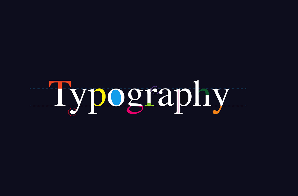
Typography Tips: Enhancing Readability in Graphic Design
Typography plays a crucial role in graphic design, influencing how content is perceived, understood, and appreciated. Beyond aesthetic appeal, typography directly impacts readability—the ease with which text can be read and understood. Whether designing for print or digital media, mastering typography is essential for effective communication. This article explores fundamental principles and practical tips to enhance readability through thoughtful typography choices.
Importance of Typography in Graphic Design
Typography encompasses the selection, arrangement, and appearance of typefaces (fonts), making it a pivotal element in visual communication. Effective typography not only conveys information but also evokes emotions and enhances the overall user experience. In graphic design, typography serves several critical functions:
- Clarity: Clear and legible typography ensures that readers can effortlessly absorb information without strain.
- Hierarchy: Establishing visual hierarchy through typography guides readers' attention, emphasizing key messages and organizing content.
- Brand Identity: Typography contributes to brand recognition and consistency, reflecting the brand's personality and values.
Principles of Readability in Typography
Achieving optimal readability involves applying fundamental principles of typography:
1. Font Selection
Choose fonts that align with the tone and purpose of your design. Serif fonts (e.g., Times New Roman) are traditional and formal, suitable for print and lengthy text. Sans-serif fonts (e.g., Arial) are modern and clean, often preferred for digital readability. Display fonts are decorative and used sparingly for emphasis.
2. Font Size and Line Spacing
Adjust font size and line spacing (leading) to enhance readability. For body text, a font size of 10-12 points is standard, while headings may require larger sizes for emphasis. Optimal line spacing is typically 1.5 times the font size, ensuring comfortable reading without overcrowding or gaps.
3. Contrast
Create sufficient contrast between text and background to improve legibility. Dark text on a light background or vice versa is generally recommended. Avoid using colors with similar tonal values, as they can cause eye strain and hinder readability.
4. Alignment and Alignment
Maintain consistent alignment (left, right, center, justified) to create a clean and organized layout. Justified text can sometimes create uneven word spacing, which may affect readability, especially in narrow columns.
5. Hierarchy and Emphasis
Establish hierarchy through variations in font size, weight (boldness), and style (italic, uppercase). Use these elements strategically to differentiate headings, subheadings, and body text, guiding readers through the content hierarchy.
Practical Tips for Enhancing Readability
Beyond the foundational principles, consider these practical tips to optimize readability in your designs:
1. Limit Font Choices
Use no more than two or three fonts in a design to maintain coherence. Pair fonts that contrast but complement each other, such as pairing a serif with a sans-serif font.
2. White Space
Embrace white space (negative space) around text elements to reduce visual clutter and improve focus. Adequate margins, padding, and spacing between paragraphs enhance readability and visual appeal.
3. Avoid Text Overload
Break up dense text into manageable chunks using headings, subheadings, bullet points, and paragraphs. This improves content digestibility and encourages readers to engage with the text.
4. Consider Context and Medium
Adapt typography choices to the medium and context of your design. Consider readability factors specific to print (e.g., ink density, paper quality) versus digital (e.g., screen resolution, responsive design).
5. Test and Iterate
Test your typography choices across different devices and platforms to ensure consistent readability. Solicit feedback from peers or conduct usability tests to identify areas for improvement.
Typography is a powerful tool in graphic design for enhancing readability and effectively communicating messages. By applying principles of font selection, spacing, contrast, hierarchy, and practical tips, designers can create visually appealing and reader-friendly designs that resonate with audiences. Remember, good typography not only makes content accessible but also elevates the overall user experience, reinforcing the importance of typography mastery in successful graphic design practices.
Mastering typography is a continuous journey of learning and refinement. By prioritizing readability and thoughtful typography choices, designers can create designs that not only look good but also communicate effectively across various media and contexts.


